


Introducing A Presidential Election Forecast Model
A reception page for the model

Welcome to my 2024 Presidential Election Forecast! While the forecast itself is displayed on that website, this page is a guide to what the model is and how it works.
Overview
I used a large set of election data,1 dating back through 1968, to create a forecasting model for the 2024 US presidential election. It generates a snapshot of the possible election outcomes on November 5th, including win percentages at both the national and state level for each major party candidate.
A couple of points about my approach:
This forecast only tracks the presidential race.
It is a polls-only forecast. All my data inputs are either national-level or state-level general election polling between the two major party candidates.2
The model accounts for the time until election day, as well as the trend data from prior polling.3
This forecast considers the margin of victory between the two major parties, not the actual vote tallies, and disregards third-party candidates in this calculation.
The model is trained on American presidential election data back through 1968.
I amnotcalculating my own polling averages.I am now calculating my own polling averages and have fully transitioned to using them for all ‘prior’ evaluations. Polls are sourced from 538’s poll aggregation interface.
Nebraska and Maine are treated as unitary states and not as places with district level electoral votes.I am now calculating the district-level odds for both Nebraska and Maine.
Electoral ties are assigned to the Republican party.4
So - how exactly does this model work?
Quick Methodological Breakdown
In a simple description, the model evaluates national and state level polling averages, then asks three questions:
How much movement are we likely to see in the polls from now until the election?
How much of an error are the polls likely to contain?
And, for questions 1 and 2, how much change in the polls is correlated between states/how much is independent?
Using data from past elections, I estimate the answer to all three questions and establish a distribution of voting outcomes. This gives me a kind of “range” of possible margin results.5 Once I’ve calculated those movement-and-error distributions, using the day’s polling averages, I run fifty thousand simulated elections. The results of those simulations create model percentages! If Kamala Harris wins twenty-six thousand times then she has a 52% chance of victory.
You can find a more detailed description of my methodology here.
Website Guide
There are currently nine sections on the website. I briefly describe each one below.
Home
This is a simple landing page with links to a few other sections.
Electoral Map
This page contains the main projection and interactive map of America, with a forecast bar at the top. Here’s an example from the archived Trump-Biden matchup:

And interactive map below:
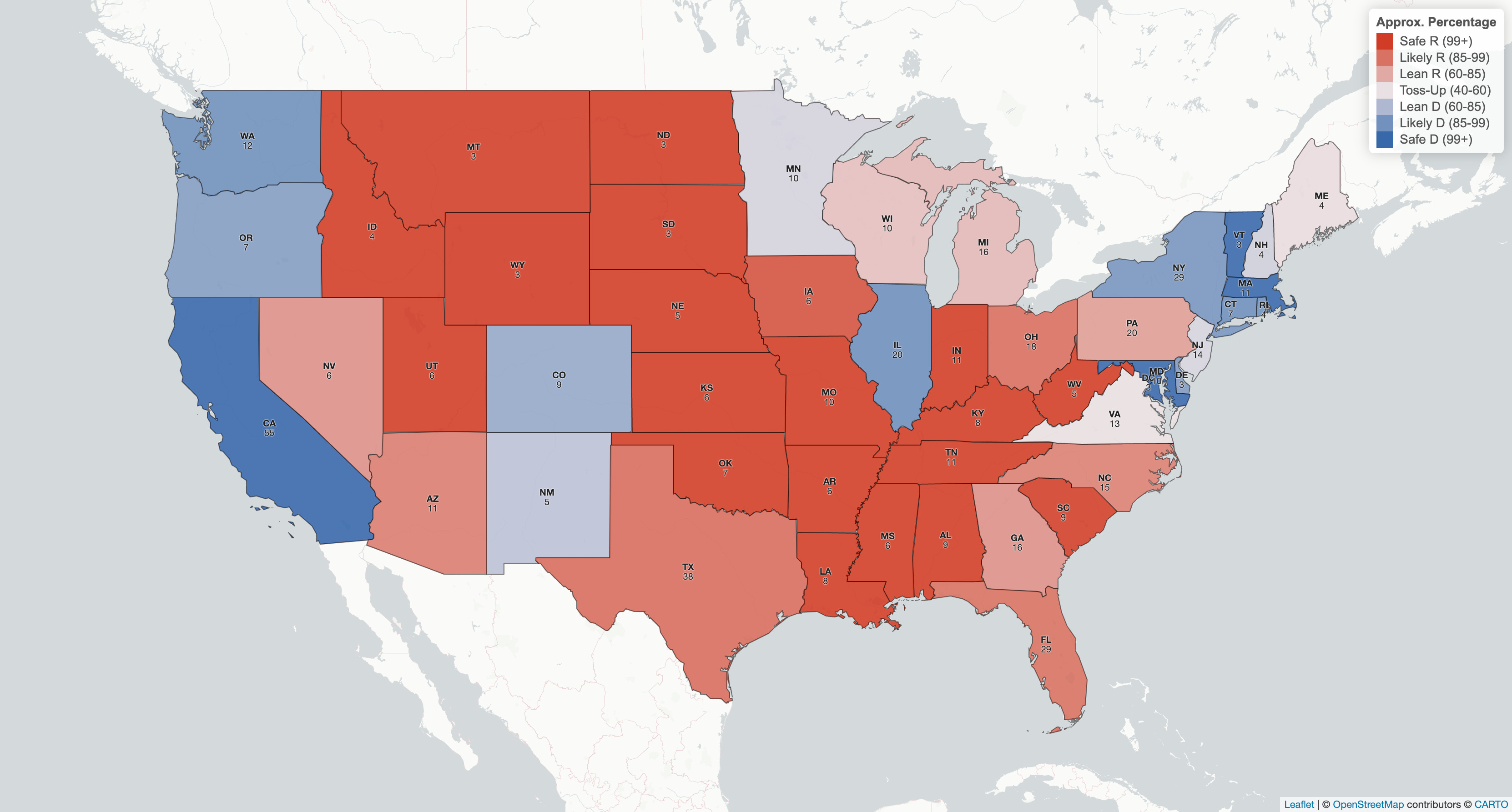
The shading is continuous within seven discrete brackets, which is just a design choice that distinguishes between both 100 - 98 and 60 - 50. The middle color is light purple, not white.
Moving the cursor over a state will show you that state’s demographics:

The last value describes how likely a state is to be the tipping-point state, a metric to estimate the state that determined or “tipped” the election. Clicking on a state will take you to that state’s tab.
Polling Averages
In the polling average tab you can find a display of polling averages dated back to Biden’s departure from the election, calculated for each state that has been polled recently at least once, plotted against the polling averages from 538 and Silver Bulletin. Beneath are two downloadable data tables: one for the polling averages, and one for the raw polls.
National
In the national tab, you can see a distribution of electoral vote tallies, a distribution of popular vote results, a measure of electoral bias, and a plot showing how the forecast has changed over time.
State
In the state tab, the upper left hand corner allows you to select the state you want to view (the default is Pennsylvania). Once chosen you will find two distributions of voting results (one density plot and one histogram), and a plot showing how the odds have changed over time.
Sandbox
The sandbox is my favorite tab. It shows a distribution of electoral college outcomes positioned above a plot of five thousand simulated results. The cool part is that, while here, you can select a set of conditions for each simulation outcome and see how it changes the forecast! I’ve allowed people to select binary results for each state (e.g. who wins Michigan), and created a tool for people to select a range of popular vote results. Want to know how the forecast will react if Republicans win the national popular vote but Democrats take Pennsylvania and Wisconsin? Go find out!
One thing to be careful of: The sandbox displays a set of conditional probabilities; they exist in the context of all that came before them.
What do I mean by this? If Trump wins New Hampshire, he has a 98.9% chance of victory.6 Does this mean his campaign should spend millions in the state, knowing it can single-handedly determine the election? Obviously not - the forecast is saying that if Trump takes NH, he almost certainly had a huge bump in the polls allowing him to sweep most of the midwest. If instead, New Hampshire were to ‘magically’ swing to Trump without impacting any other part of the race, Trump’s odds are a mere 53.1% (though still up from 48.5%).
To help illustrate this, I’ve plotted a random sample of election results and showed how the results change with each condition. If Trump wins New Hampshire:
You can see that he nearly always wins the election and popular vote, but only in the handful of simulations (~10%) that allow for such an unlikely outcome.
Data
I have also included a tab displaying all of my simulation data. There are two data tables you can interface with on the website: one table of simulation results for each state and one table of national popular vote percentage brackets for the election.7 You can download both tables for yourself as a CSV file.
I have also included a way to download all fifty-thousand raw simulation results. The datafile is too large to display online, but you can examine them for yourself and see exactly what I am predicting. This is not common -I don’t know of any other forecasts that make such granular data accessible- but I wanted to include it for two reasons:
First: publishing raw data is usually good because it lets other people make their own discoveries and sometimes catch errors. If you run an analysis of my results and find something wacky, absolutely let me know!

Second: it’s a sort of roundabout way to validate my model. I don’t have a name in this field, and I haven’t published any research, so offering up my results is an easy way to prove that I’m at least doing something. It would, for a truly cynical opportunist, be relatively easy to invent and/or steal meaningless values for a model to display. Coming up with fifty plausible numbers is not very difficult. Coming up with a fifty-thousand-by-fifty-two simulation matrix with plausible distributions/correlations though? I honestly have no idea how someone could fake that. It would require a level of election knowledge and skill that just equates to building a forecast.

Sources & Info
This is a short little blurb describing the model and some of the methods/sources I’ve used. Everything there is covered on this page, and in more depth.
Archived: Biden v Trump
This last tab contains a hyperlink that will take you directly to an identical election forecast for the Biden-Trump matchup. It shows how my model considered Biden’s odds, as archived on July 21st.8
Additional Information
Model Assumptions
The model makes the following assumptions:
The general election will take place between Kamala Harris and Donald Trump on November 5th, 2024.
All prior election results back through 1968 are equally indicative of an election’s national polling error, national polling movement, and state polling error.
All state-level election results dating back through 1972 are equally indicative of interstate covariance, including the national-to-state correlation.
All election results dating back through 2000 are equally indicative of state-level polling error.
All polling movement and errors are distributed symmetrically around the origin; they are as likely to skew Democrat as they are to skew Republican.9
Editing Process
The model has gone through four major revisions before being deployed. I began with a general concept and then made changes if/when I saw that a test had returned an absurd result. This strategy stops me from simply fine tuning to whatever result “feels” correct, which can be a difficult balance to strike.
One example: An early test run found that Biden’s odds of winning Pennsylvania and Michigan were roughly 50 and 40 percent, which seemed plausible. Yet I realized that beyond those numbers, there was only a 0.02% chance of the two states diverging! I didn’t know what the “correct” odds were of Biden winning Pennsylvania while losing Michigan, but I knew the odds were better than 1-in-5000.
Contribution
While presidential forecasting models aren’t common, they also aren’t especially rare, so it’s worth asking what my project brings to the table. I think my model offers three substantive contributions:
I’ve added a data point to the field. It’s boring but still meaningful; the average of all models is probably better than any individual forecast.
I made an engaging interactive that allows a user to see how various custom filters change the election outcome.
And, alongside the aggregated results, I’ve made all of my 50k raw simulations accessible to anyone interested (more on points 2 and 3 below).
Additionally, it’s accessible to everyone.
Disclaimer
There’s a popular aphorism in the field of applied mathematics:
All models are wrong, but some are useful.
It captures the idea that, while math can tell us a lot about the nature of the world, no simple set of equations fully capture its complexity. My model is ultimately an estimate, and it’s a young one; I expect to be fine-tuning it for at least another month.
I do think it’s a pretty good estimate -it is derived by applying common statistical techniques to a relatively well-understood dataset- but nowhere near infallible. I only make predictions based on what the polls say today, I can’t foresee any specific events, and I don’t even try to account for things like actuarial risk.
We ultimately do not know what is going to happen in November, and we will not know until the election transpires. By all means, use my model to make informed estimates about the likelihood of a certain outcome. I designed it to be of use! But also know that this world is messy, and all we can do in the face of uncertainty is improve our estimation techniques. There are no clairvoyant oracles.
Final Comments
I am planning to update the model as regularly as I can, multiple times each week, and will write about it periodically. I may add a senate, house and/or fundamentals forecast, but will have to see how my time shakes out.
Thank you all for your interest! This is a personal project that I’ve spent a lot of time working on and thinking about, so I appreciate the support. If you have any comments/questions/concerns/etc. feel free to contact me at benjamingrayzel@gmail.com.
Polling information is sourced from FiveThirtyEight and Silver Bulletin, while election data comes from MIT’s Data Science Lab and Dave Liep’s Election Atlas. Shoutout to Jackson Jude’s GitHub for some early test data!
There are no economic/incumbent/financial considerations, although I may add this ‘fundamentals’ type of model if I can find the time.
For Harris’s margin against Trump we only consider polls conducted after Biden’s official withdraw from the race. However the volatility, which is an input in the polling movement calculation, is derived from polls dating back to the June debate.
As they control the tie-breaking House of Representatives
For a specific example, I estimate the national polling margin-of-error as a normally distributed random variable with a mean of 0 and standard deviation of ~3.7. Read more about the methodology here.
As of August 8th.
While my numbers are completely original, full credit to Silver Bulletin’s forecast for the idea and design of this datatable.
I occasionally update the interface for the sake of consistency, but the data remains fixed from that day on.
Although this is a somewhat large assumption at the state level.
Benjamin graduated from Dartmouth College in 2024, where he studied mathematics and political science. He is returning to pursue a Master’s degree in computer science. He also thinks it’s really strange to write this about himself in the third person.